March 7, 2014

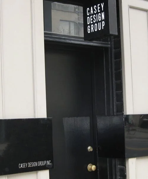
Casey Design/Planning Group Inc. - Photo by Ted Yarwood.

Our home is a 1930s brick coach house built in the middle of the Art Deco period. My husband and I wanted to reflect this period in the look of the kitchen, but we also wanted to make this kitchen highly functional, with today's best appliances and with enough space for both of us to work together.

For myself and my clients, the first thing I start with are the functional requirements of a space. Good design always starts here. A room or space can be aesthetically dressed in many ways, but the function must be at the core. In this case, the space was small and we had a number of requirements; That the space be versatile enough to be closed off to the living room when required, but opened when desired. That two people be able to work comfortably together side-by-side, and that all appliances large and small be hidden to create a clean workspace. Lastly, that the kitchen allow us to create large meals for our many dinner parties and family gatherings.

With this in mind, the inspiration for our kitchen was the 1930s luxury oceanliners. The typical kitchen aboard such a vessel is usually laid out in a highly efficient style, with longitudinal units and overhead cabinets. This makes the best use of the usually limited space with the minimum required movement between appliances. 

This was perfect for what we were trying to achieve with our kitchen. 

Plans and elevations looked for basic standard functions of the kitchen, then all the individual requirements for each of us was taken into account; like where to put the juicer, the toaster, the coffee maker, the blender and the cuisinart, which we wanted out of view. The maxim; "everything in its place and a place for everything," was our guiding principle. For example, an open shelf was inset into one of the walls to display my collection of vintage objects, artwork and special glassware .

We followed that up by mocking up the entire kitchen full scale in cardboard, something that might be considered overkill. However, it showed us three-dimensionally that two people working in the kitchen would have enough space to work side by side.

Once we established the plan we moved onto how the kitchen would look. Going back to our original inspiration, the ocean liners of that period often used luxury materials. So we chose to design the cabinets using hand selected cherrywood veneer, with each sheet carefully chosen with our cabinetmaker. It was hand finished like fine furniture (not sprayed) to give a rich luxurious finish and we combined it with natural unfinished brass, which develops a luscious patina over time. The design of the brass inset into the cherrywood achieved two things:  a visually rich combination with the cherry wood and it became the cabinet's door pulls, thus avoiding having to use standard hardware. The marble walls were selected as a foil to the solid cherry wood. The linear nature of the marble contrasted with the solid density of the cherry cabinets to create tension and boldness. I love the drama created through the high contrast of these light and dark materials!  

To keep everything clean and tucked away; the fridge, dishwasher, pantry, recycling and garbage, and the stovefan are all hidden behind cabinetry. Our appliances are all by the German company Miele and were selected because of their high-quality, as well as their European size - meaning small. One unusual appliance we installed was the steam oven. It encourages health-conscious eating - steamed fish and vegetables are staples - and it also acts as a microwave substitute to heat food. 

A sliding door allows for privacy as well as openness to the living room/dining room. 

The light fixture also has a story behind it. We try to regularly attend the Venice Art Bienniale exhibition, and on one trip we were given the name of a lady who lived outside of Venice and sold antique light fixtures. When we arrived, it could best be described as a lighting graveyard. For as far as the eye could see, she had compiled pieces of lighting fixtures in a dirt field that were to be assembled by her craftspeople. Of course, I was in heaven! I made my way through, gathering bits and pieces, and one of those bits and pieces ended up being our light fixture in the kitchen. I love bringing these types of elements into homes because they have stories and so much more meaning than buying something from a catalog. 

In the end, we absolutely love our kitchen. We feel that it is more efficient than our previous home which had a much larger kitchen, and the time we spent to analyze how we both could work in the kitchen together really paid off. We never get tired of it, and it still looks as good today as the day it was finished, each day gaining a little bit more patina and adding to the stories of our lives.

Our kitchen was featured in the March 2014 issue of House & Home.


January 17, 2013

The New York Times Style Magazine featured a Chicago high-rise featuring gilding and mirrors.

One recent installation by Casey Design combined mirror and silver leaf to create a dynamic opening impression in a client’s foyer. The small space needed a boost, and we thought mirrors would be a bold way to add interest as well as to expand the space. We have used mirror extensively before, on feature walls, or by covering a fireplace wall, but never in conjunction with the silver leaf.

A similar Chicago project, featured in a 2011 issue of The New York Times Style Magazine, used gold leaf on the moulding in a combination with mirrors inside the panels. In our case, we wanted a more contemporary style so we chose to silver leaf the moulding of the panelled walls, and installed beveled mirrors onto the entire wall surface surrounding the moulding. 

Gold leafing or gilding has been used historically for surface decoration to give objects the appearance of being solid gold or silver by covering the base with thin layers of foil or 'leaf'. Both silver and gold leaf are finicky materials to work with, and take expertise and patience to apply flawlessly. Thankfully we had our talented artist/designer, Kari Serrao, execute the silver leafing. Here are the steps undertaken for the foyer: a base clay coating was painted on the moulding, then a layer of clear glue was applied, then the leaf was carefully applied, and finally a finish lacquer coat sealed the surface. The next big step was to have our mirror installers do extensive measuring and calculating for the over 100 pieces of mirror. The final result: a transformed entryway and a vastly enhanced spacious foyer, with drama and depth. The clients were thrilled!

A client's mirrored foyer with a custom floating, lacquer table. (Photo by Ted Yarwood)

The floor-to-ceiling mirrored fireplace emphasizes the verticality and expands the space. (Photo by Ted Yarwood)

The client's foyer before the work began.

Designer & artist, Kari Serrao, beginning the silver leaf process.

The foyer once the silver leaf and lacquer was applied.

Mirror pieces were measured, cut and numbered to ensure they were installed correctly.

All of the pieces are starting to come together.

It's almost finished! 

In process - installing the final mirrors. 

This girl's bathroom is completed with mirrored panels that have hidden storage behind. Any girl's dream come true. (Photo by Ted Yarwood)


November 26, 2013

A designated Family Room creates the perfect place for the children to play and watch TV. (Casey Design/Planning Group Inc. - Photo by Ted Yarwood)

It is often thought to be impossible to keep your home neat and tidy and stylish once the children arrive. Images of all the toys and clutter associated with children come to mind. However, if planned correctly, it can be possible to have both a chic, beautiful home and a big family to live in it. You just need to adopt family-friendly design concepts to accommodate your growing family as you create the style of your dreams.

Key points to remember for family-friendly design: You can always create separate spaces for the children and adults to entertain or hangout. A third floor family room gives the children a place to watch TV and listen to music, while a master suite can create a calming space for parents to relax in. Use kid-friendly fabrics and furniture that can be easily cleaned. This does not mean you have to settle for childish patterns. A bold, green, vinyl wallcovering with assorted vintage letters adds interest and warmth to the room for both adults and children. It also creates a modern space you can be proud of. Storage is another important factor as children come with a lot of stuff. You need to find ways to store their toys and books in a manner that adds to the design of the room. Use storage and shelving that makes everything easily accessible, but can hide the more unsightly clutter. A contemporary, white gloss cabinet with a mix of open shelves and closed cupboards does just that, for example. Lastly, you should simultaneously incorporate the personalities of the children and create a room that they can grow with, so you don’t need to re-do the rooms every couple of years. A client’s son had an interest in collecting toy cars, and we found an antique glass cabinet and created custom, steel shelves to display them. These pieces will remain classic bedroom pieces that he can grow with and they add sophistication to the room, while the collection of toys brings the fun of childhood.

This cozy banquette provides additional space for the client's teenagers to hangout. (Casey Design/Planning Group Inc. - Photo by Ted Yarwood)

Master Suite with fireplace, seating area and spa-like washroom for parents of three to retreat to. (Casey Design/Planning Group Inc. - Photo by Ted Yarwood)

Two Storey "Great Room" fit for family as well as catered business functions with its separate pantry. (Casey Design/Planning Group Inc. - Photo by Ted Yarwood)

Kid-Friendly wallpaper with assorted vintage letters that adds interest to the room. (Casey Design/Planning Group Inc. - Photo by Michael Graydon)

These polkda dot shower curtains enhance the design while adding a fun element to the bathroom. (Casey Design/Planning Group Inc. - Photo by Ted Yarwood)

Contemporary, white gloss cabinet that is perfect for storage. (Casey Design/Planning Group Inc. - Photo by Michael Graydon)

Side Mud Room with cubby storage for the whole family. (Casey Design/Planning Group Inc. - Photo by Ted Yarwood)

Antique, glass cabinet and steel shelving to  display our client's son's toy car collection. (Casey Design/Planning Group Inc. - Photo by Ted Yarwood)

Bedroom that plays off of our client's daughter's fashion interests. (Casey Design/Planning Group Inc. - Photo by Ted Yarwood)

A bathroom created for a teenage girl that will grow with her. (Casey Design/Planning Group Inc. - Photo by Ted Yarwood)


November 8, 2013

A day at Casey Design/Planning Group Inc.

A day at Casey Design/Planning Group Inc.

A day in the life of an interior designer is very hectic and crammed with multiple duties and responsibilities. As a designer, Theresa Casey ends up wearing many different hats. That is to say she plays many roles for her clients in her day-to-day working life. She can be a space planner, a floral designer, a photo-shoot stylist, a personal shopper and so much more. She is always moving, always going and always thinking about the clients and their projects. These are just a few of the hats she wears:

Drawings. It should be no surprise that as a designer Theresa has to continuously channel her inner artist and bring her creative ideas and designs to life by putting pen to paper and proofing CAD drawings. However, there are many different purposes to the drawings. She may review and create design concepts for a client’s space. Or she works on drawings for contractors in order to relay the design ideas she and her clients have developed. She also works directly with suppliers to design and produce custom pieces.

Site Visits. Once plans have been drawn and construction begins, Theresa makes a point of frequently stopping by the sites to ensure that everything is going to plan. That means she is checking to ensure that the client’s drawings are being adhered to, as well as answering any questions the general contractors may have. And much like her digital tools, Theresa has a troubleshoot button too. When any issue arises on site, Theresa is there to creatively solve them.

Decal Installs. As you can tell, Theresa is very hands on in everything she does from start to finish, and everything in between. This, for example, might include a decal wall installation. With the help of her intermediate designer, Kari Serrao, Theresa laid out the design of a tree decal for a client’s nursery - a very detail-oriented but ultimately satisfying process.

Model Houses. The ultimate time-consuming process is that of building a new home from scratch, and Theresa works through every phase to see it to completion. Model making usually begins with massing concepts and building forms to conceptualize the structure and begin space planning. Senior designer, James Janz, ably helps her wear this hat.

Sourcing. While shopping sounds like more fun than many of her other duties, it is not a task that Theresa takes lightly. She always diligently searches Designer’s Walk and other design venues for the furniture, lighting, fabric etc. that will suit her clients’ needs. She ensures that anything bought will not only match the client’s styles, but also their budgets and overall design concepts. All the different aspects that go into every purchase make this a challenging task. Last week, for example, Theresa explored the Primavera showroom hunting for the perfect striped fabric for a client’s nursery to match the existing furniture, wall colour and newly installed tree decal.

It is very interesting to watch Theresa work, as she is always taking on something new and exciting. I always wonder what hat she’ll put on next!


Posted
AuthorTheresa Casey

October 15, 2013

Shell Chair with wooden arms carved as fishes (Photo by Ted Yarwood)

1.  I consider it an honour to be invited into people’s homes and for them to tell me about their passions and desire to make their homes a reflection of themselves.

2.  It’s fun - we get to play together. Sometimes we are simply move furniture around, bring up stored furniture in the basement up to the main floor or brainstorm about how to make the space functional and funky, stylish or whatever mood suits you. Sometimes it’s as easy as that – moving furniture and making a room more comfortable and functional.


3.  It’s like being a kid again – playing house, making models and looking at the possibilities of your space.

James Janz rearranging furniture in a client's home.

James Janz rearranging furniture in a client's home.

James is massing concepts and building a model home.

James is massing concepts and building a model home.

4.  When clients realize that it is possible to have a home that they are thrilled to come home to and have their friends visit.

White Walls to lighten Basement Office (Photo by Angus Fergusson)

Fabric Upholstered Walls for French Deco design (Photo by Angus Fergusson)

5.  That this doesn’t need to be domain of the rich and famous or intimidating in any way. Not everyone has the budget for a major (or a minor) renovation, but,  there is room for everyone. A two-hour consult allows you take advantage of experienced, problem solving dynamo-design brains. For me, the best part is the look of relief on my client’s faces when they see what is possible in their space.


6.  It pushes me to see new points of view and my client’s interests that I have had no previous exposure to, like one of my clients who collects antique toy soldiers. His collection was stored away in boxes because he didn’t have a way to display it. We jumped to the challenge by designing built-in cabinetry that would ultimately be moved to their country home,  yet still work in their historic downtown home.


Built-in White Oak Cabinet with glass door display case above and shelving below (Photo by Ted Yarwood)

7.  Every job is always a challenge, new and different (as it should be!). There are some similarities from client to client, but ultimately, it’s about each individual client.


8.  I love getting people unstuck. With a few key moves we can get a stalled project moving. See this before and after.

BEFORE - The client's kitchen was cold and outdate.

AFTER - We rejuvenated this kitchen by updating the cabinets with a new paint job and by raising their height. (Photo by Donna Griffith)

9.  I get to play like a kid and be inspired by my travels. A great example is the "Elephant Love Tree" that we created for the Gardiner Museum "12 trees for the holidays". The theme was "All things great and small" and as one of the selects designers we were allowed to choose our concept. Having just returned from India, as a Canadian delegate for an interior design trade mission, we we're inspired to respond with a bejewelled giant elephant tree. See some of the images that inspired us and the resulting Elephant love Tree.

The decoupaged elephant head encrusted with jewels, glitter and brass fixings.

The decoupaged elephant head encrusted with jewels, glitter and brass fixings.

Homemade gingerbread ornaments hang from the tree.

Homemade gingerbread ornaments hang from the tree.

Theresa Casey and Kari Serrao with the "Elephant Love Tree."

Theresa Casey and Kari Serrao with the "Elephant Love Tree."

Inspiration from Theresa's trip to India.

Inspiration from Theresa's trip to India.

#9d.jpg
#9c.jpg

10.  Because it combines all my loves and passions: fine art, antiques, history, travel and discovering new talents in art and design.