June 6, 2014

Theresa Casey in the lower courtyard of her eclectic garden.

The May 2014 issue of House & Home features an inspired courtyard garden designed by Theresa and her husband, Robert. Not only is it beautiful, it serves a variety of functions -  eating and entertaining, relaxing, gardening and creating art in the studio. To achieve this, four zones were planned: an upper terrace, a lower courtyard, a cozy sitting area and an artist's studio in the underused garage. 

A rich layering of textures, such as stone, brick, wood, iron and lush planting beds create a visual and sensory oasis in the city, reminiscent of European courtyards nestled in small, hidden urban spaces.

If you are interested in more details about the story behind this urban retreat, check out the May 2014 issue of House & Home. Below you will find a few shots showing the construction of the garden and scenes from the magazine photo shoot.

Theresa's husband, Robert, mapping out the lower courtyard, following the plan's outline of the upper terrace/dinning area.

The garden, stripped down to its bare elements - including the single slab stone bench at the back - before weathered stone was laid for the floor and steps up to the terrace.

Casey Design/Planning Group is featured in the May 2014 House & Home "Inspired Home" issue.

The garden in full growth after the reconstruction - seen from the back - with the salvaged fountain centered in the lower courtyard.

Egyptian Deco doors lead into Theresa's studio from the stone courtyard. 

Once a garage used for storage, the studio features exposed brick, salvaged antique French clay  tiles and wood beams that create a sense of age and character. 

The walls and tables are adorned with found objects and inspirational images from Theresa's eclectic collections.

At the photo shoot, photographer Donna Griffith checks her lighting and image cropping before taking her superb photographs. 

Behind the scenes in Theresa’s studio, Donna works to get the perfect angle

The end result - a lush, romantic and inspirational courtyard that welcomes  many different uses and acts as a "growing canvas" for the designer's ideas and creative experiments.


Posted
AuthorTheresa Casey

April 30, 2014

Love the textured, diamond-patterned brown floor with the graphic pillows surrounded by the white backdrop. Simply sophisticated! (DPages).

When I think of white and brown colour schemes, I think of a well-dressed French woman. A crisp white blouse, tan linen pencil skirt, smart pumps and a killer handbag. To me, whites and browns evoke a classic French woman's style.

In short, elegance with purpose. It's what I wear on days that I want the world to know I mean business. This same kind of thinking can be applied to interiors. If you are confident yet don't want to show off, if you know your style and don't want your home to speak before you do, then this kind of palette might be for you. 

In the samples below, you can see right away what I'm talking about. For me these interiors have the look of an airy Manhattan apartment on the upper Eastside - glamorous, soft, soothing and welcoming, while speaking of quiet sophistication. 

If you are that person or want to be perceived as this person, this look is for you. Interiors are always about the fantasy to which you aspire, what environment you're most comfortable in, and sometimes an elegant wardrobe can be the starting point.

A minimalistic brown and white office is so inviting and chic (Flickr).

The walnut, double vanity in combination with the creamy, white onyx floors and walls creates a glamorous soft and soothing ensuite retreat (Casey Design/Planning Group Inc. - Photo by Ted Yarwood).

Ethan Herringbone dinnerware by Ralph Lauren Home (Elle Decor).

The soft, multi-texutred tan and white color theme with the accent of the vintage brown metal cabinet creates a classic, calm and groovy apartment (Flickr).

The brown sofa in this country master suite with painted oak floors and travertine marble is dreamy and tranquil  (Casey Design/Planning Group Inc. - Photo by Ted Yarwood).

The brown and white wallpaper layered with the vintage vanity makes this powder room a knock out (Mark D Sikes).


Posted
AuthorTheresa Casey
CategoriesInterior

April 4, 2014

Look how wonderful this stripped chair looks with this Damask fabric wall! (Casey Design/Planning Group Inc. - Photo by Angus Fergusson).

Look how wonderful this stripped chair looks with this Damask fabric wall! (Casey Design/Planning Group Inc. - Photo by Angus Fergusson).

I must say I love a stripe!  So very versatile, it adds a tailored quality to drapery, upholstery or flooring. In terms of colour, a multicoloured stripe can be used to create a sporty energetic vibe, a black-and-white stripe can give a dynamic graphic punch or a tone on tone stripe can add interest without overpowering a space. The images below show how I have used stripes to create different effects, as well as projects by others I admire. I love them all!

This traditional study has a soft, light-green palette and the striped draperies create a graphic yet warm quality (Casey Design/Planning Group Inc. - Photo by Ted Yarwood).

You can't go wrong with a multicolor stripe! (Oliver Yaphe)

 Wow! What a way to transform a hallway! (Elle Decor).

Love the black and white themed office with the punch of black and white stripe! (Casey Design/Planning Group Inc. - Photo by Angus Fergusson).

Art deco era master ensuite featuring cozy, striped settee (Casey Design/Planning Group Inc. - Photo by Ted Yarwood).

Love this! (Tumblir).


Posted
AuthorTheresa Casey

March 28, 2014

Love this cozy library/dining room featuring black walls (Elle Decor).

Painting your walls black might not be the first thing that comes to mind when you're looking at paint colours. But, this is a very powerful tool in your paint selection toolbox and technically, black isn't even a color, so it deserves special attention. Sometimes when designing a home we want to have an area that's cozy and warm, and holds us in. Perhaps you live in a cold climate and you want to have an enveloping atmosphere when you come home at night. For this scenario, I suggest painting a cozy study, small family or living room black. Or if you want to create drama, say in your powder room, black is for you. In my own office powder room, a previously uninspired space was given high drama by painting the walls and ceiling glossy black in combination with a white vintage porcelain sink, antique brass faucets and a gold leaf mirror. The white sink gives some relief to the surrounding black, while the brass adds warmth and glamour. If the thought of black terrifies you, you can almost go there by using a deep eggplant purple paint like Farrow and Ball Mahogany #36. It's very warm and cozy, and you get all the effects of black paint without going as far. Another way to use black would be to paint an accent wall black or the inside of an archway. My point is that color, paint and atmosphere are very personal and all very achievable with a can of paint, so experiment a little and try something a little out of your comfort zone. See below some of the effects you can create with a simple can of black paint. 

Black accents really create a wonderful, graphic bathroom (Paloma).

Living room, cozy heaven. Love the portraits! (Elle Decor).

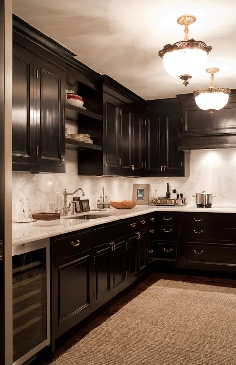
See the drama and richness of these black kitchen cabinets (Casey Design/Planning Group Inc. - Photo by Ted Yarwood).

See the drama and richness of these black kitchen cabinets (Casey Design/Planning Group Inc. - Photo by Ted Yarwood).

Living room: love the black walls, contrasted with the wife sofas and fantastic, patterned coffee table (Elle Decor).

The deep eggplant walls have a similar effect to the black walls, but is a softer and warmer paint selection (Casey Design/Planning Group Inc. - Photo by Ted Yarwood).


Posted
AuthorTheresa Casey

March 7, 2014

Casey Design/Planning Group Inc. - Photo by Ted Yarwood.

Our home is a 1930s brick coach house built in the middle of the Art Deco period. My husband and I wanted to reflect this period in the look of the kitchen, but we also wanted to make this kitchen highly functional, with today's best appliances and with enough space for both of us to work together.

For myself and my clients, the first thing I start with are the functional requirements of a space. Good design always starts here. A room or space can be aesthetically dressed in many ways, but the function must be at the core. In this case, the space was small and we had a number of requirements; That the space be versatile enough to be closed off to the living room when required, but opened when desired. That two people be able to work comfortably together side-by-side, and that all appliances large and small be hidden to create a clean workspace. Lastly, that the kitchen allow us to create large meals for our many dinner parties and family gatherings.

With this in mind, the inspiration for our kitchen was the 1930s luxury oceanliners. The typical kitchen aboard such a vessel is usually laid out in a highly efficient style, with longitudinal units and overhead cabinets. This makes the best use of the usually limited space with the minimum required movement between appliances. 

This was perfect for what we were trying to achieve with our kitchen. 

Plans and elevations looked for basic standard functions of the kitchen, then all the individual requirements for each of us was taken into account; like where to put the juicer, the toaster, the coffee maker, the blender and the cuisinart, which we wanted out of view. The maxim; "everything in its place and a place for everything," was our guiding principle. For example, an open shelf was inset into one of the walls to display my collection of vintage objects, artwork and special glassware .

We followed that up by mocking up the entire kitchen full scale in cardboard, something that might be considered overkill. However, it showed us three-dimensionally that two people working in the kitchen would have enough space to work side by side.

Once we established the plan we moved onto how the kitchen would look. Going back to our original inspiration, the ocean liners of that period often used luxury materials. So we chose to design the cabinets using hand selected cherrywood veneer, with each sheet carefully chosen with our cabinetmaker. It was hand finished like fine furniture (not sprayed) to give a rich luxurious finish and we combined it with natural unfinished brass, which develops a luscious patina over time. The design of the brass inset into the cherrywood achieved two things:  a visually rich combination with the cherry wood and it became the cabinet's door pulls, thus avoiding having to use standard hardware. The marble walls were selected as a foil to the solid cherry wood. The linear nature of the marble contrasted with the solid density of the cherry cabinets to create tension and boldness. I love the drama created through the high contrast of these light and dark materials!  

To keep everything clean and tucked away; the fridge, dishwasher, pantry, recycling and garbage, and the stovefan are all hidden behind cabinetry. Our appliances are all by the German company Miele and were selected because of their high-quality, as well as their European size - meaning small. One unusual appliance we installed was the steam oven. It encourages health-conscious eating - steamed fish and vegetables are staples - and it also acts as a microwave substitute to heat food. 

A sliding door allows for privacy as well as openness to the living room/dining room. 

The light fixture also has a story behind it. We try to regularly attend the Venice Art Bienniale exhibition, and on one trip we were given the name of a lady who lived outside of Venice and sold antique light fixtures. When we arrived, it could best be described as a lighting graveyard. For as far as the eye could see, she had compiled pieces of lighting fixtures in a dirt field that were to be assembled by her craftspeople. Of course, I was in heaven! I made my way through, gathering bits and pieces, and one of those bits and pieces ended up being our light fixture in the kitchen. I love bringing these types of elements into homes because they have stories and so much more meaning than buying something from a catalog. 

In the end, we absolutely love our kitchen. We feel that it is more efficient than our previous home which had a much larger kitchen, and the time we spent to analyze how we both could work in the kitchen together really paid off. We never get tired of it, and it still looks as good today as the day it was finished, each day gaining a little bit more patina and adding to the stories of our lives.

Our kitchen was featured in the March 2014 issue of House & Home.